
Web Design That Builds Trust
Websites where design helps the content work better and makes it easier for visitors to find their way.
Selected projects
Examples of websites where design, content, and the visitor journey work together as one thoughtful whole.
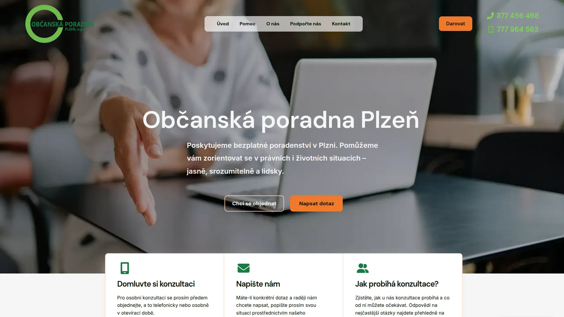
Civic Advisory Center Pilsen
Website Redesign for a Clear and Client-Friendly Experience
Information Architecture • UI/UX • Content Creation
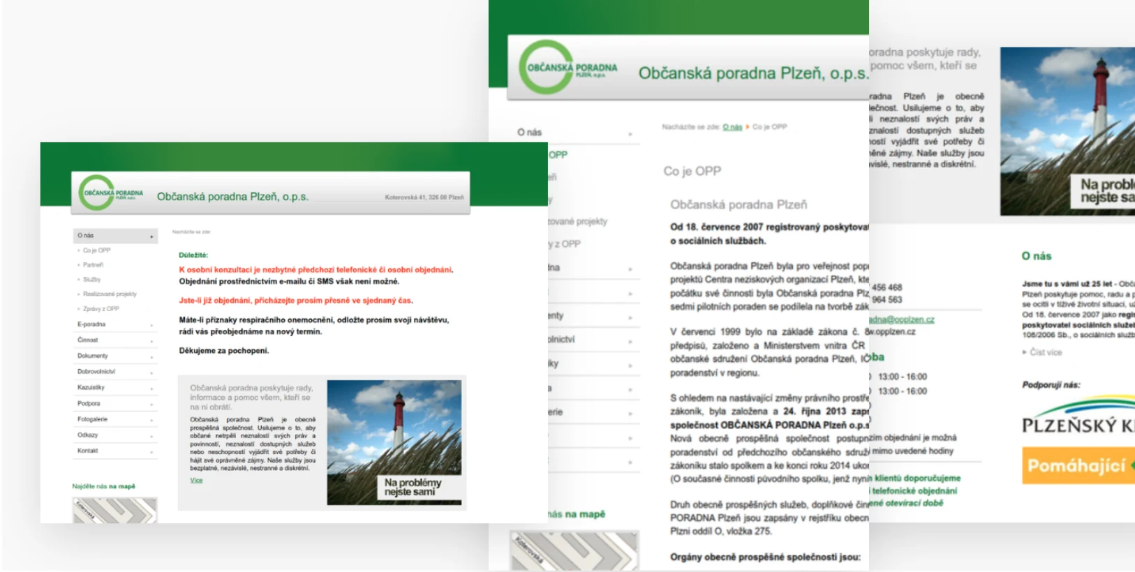
The Citizens’ Advice Centre in Pilsen required a redesign of its nearly 20-year-old website, which no longer met current standards for clarity and credibility.
Original Website
Redesigned Website
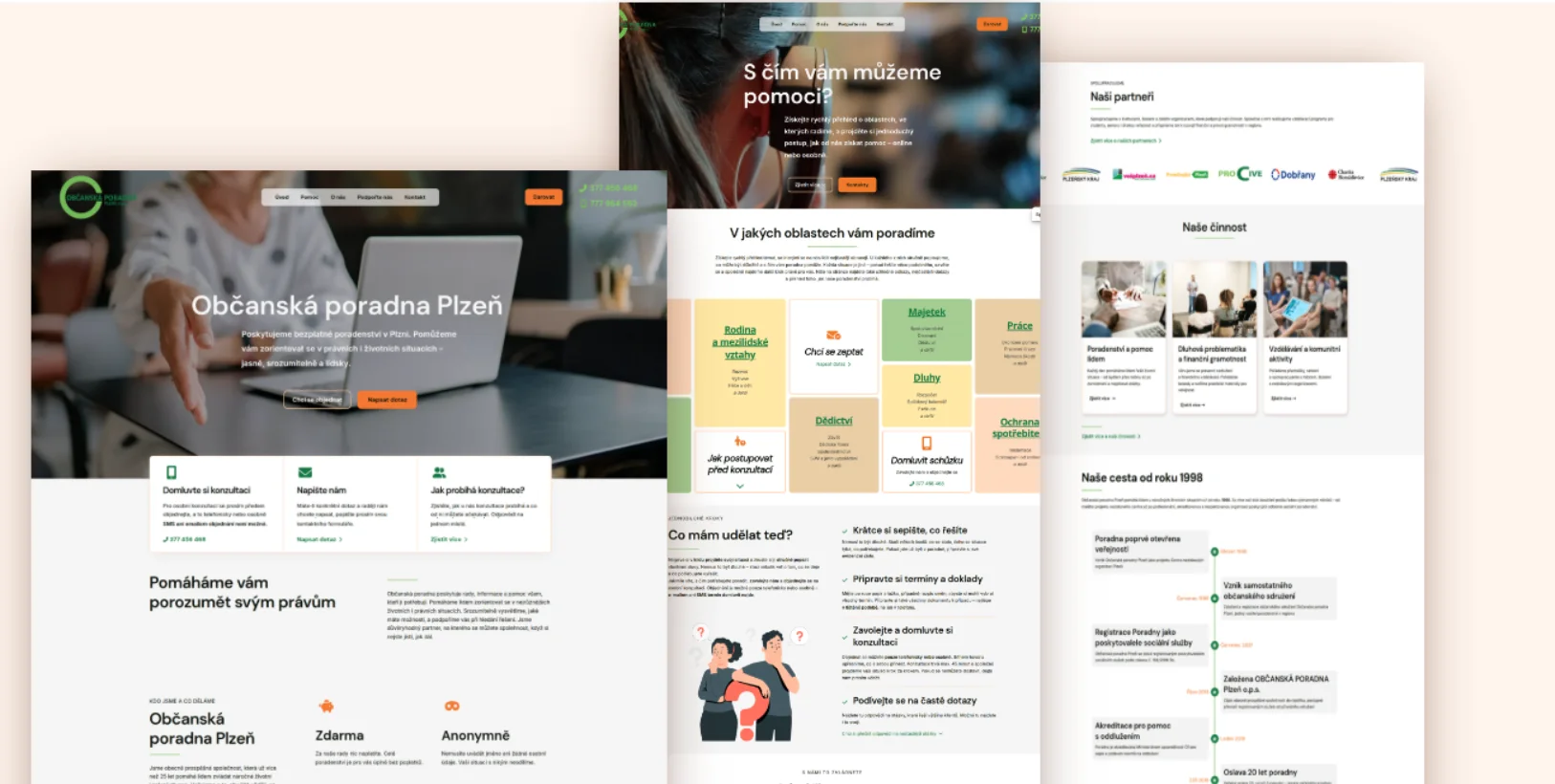
Initial State
Outdated design, unclear structure, overwhelming information, and a lack of user guidance.
My Approach
Result
The website is now clear, trustworthy, and genuinely serves the needs of its visitors, while remaining a fully functional information source for public authorities.
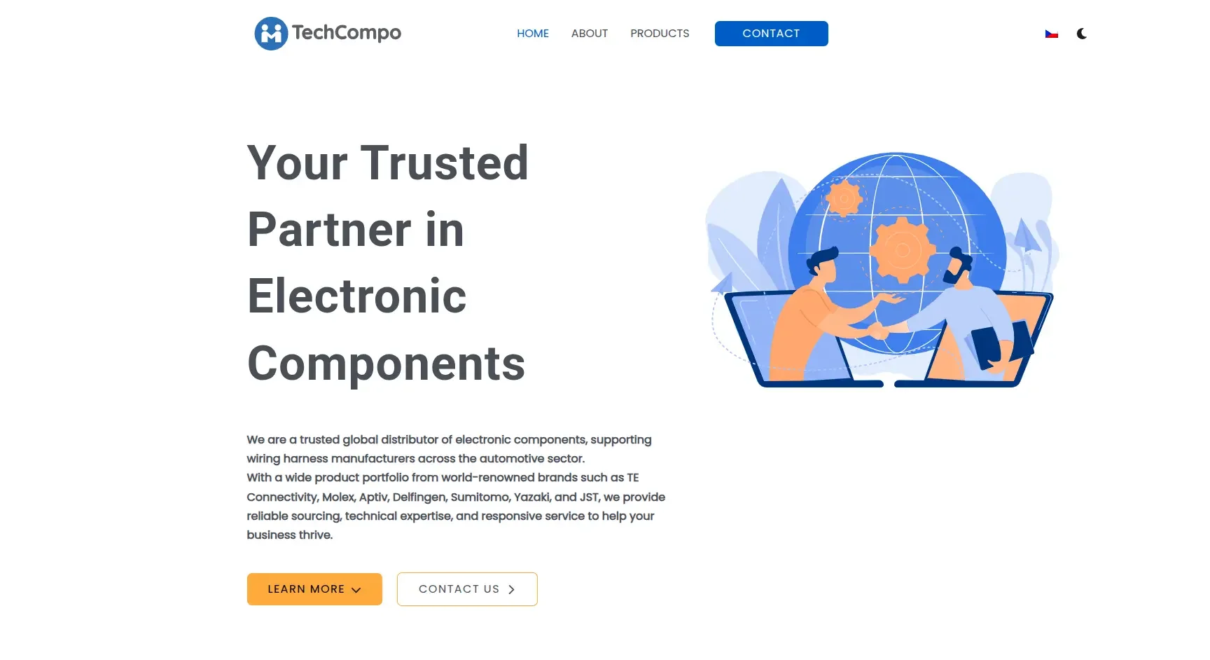
Techcompo
Transformation of a Corporate Website for the International B2B Market
Information Architecture • UI/UX • Content Creation
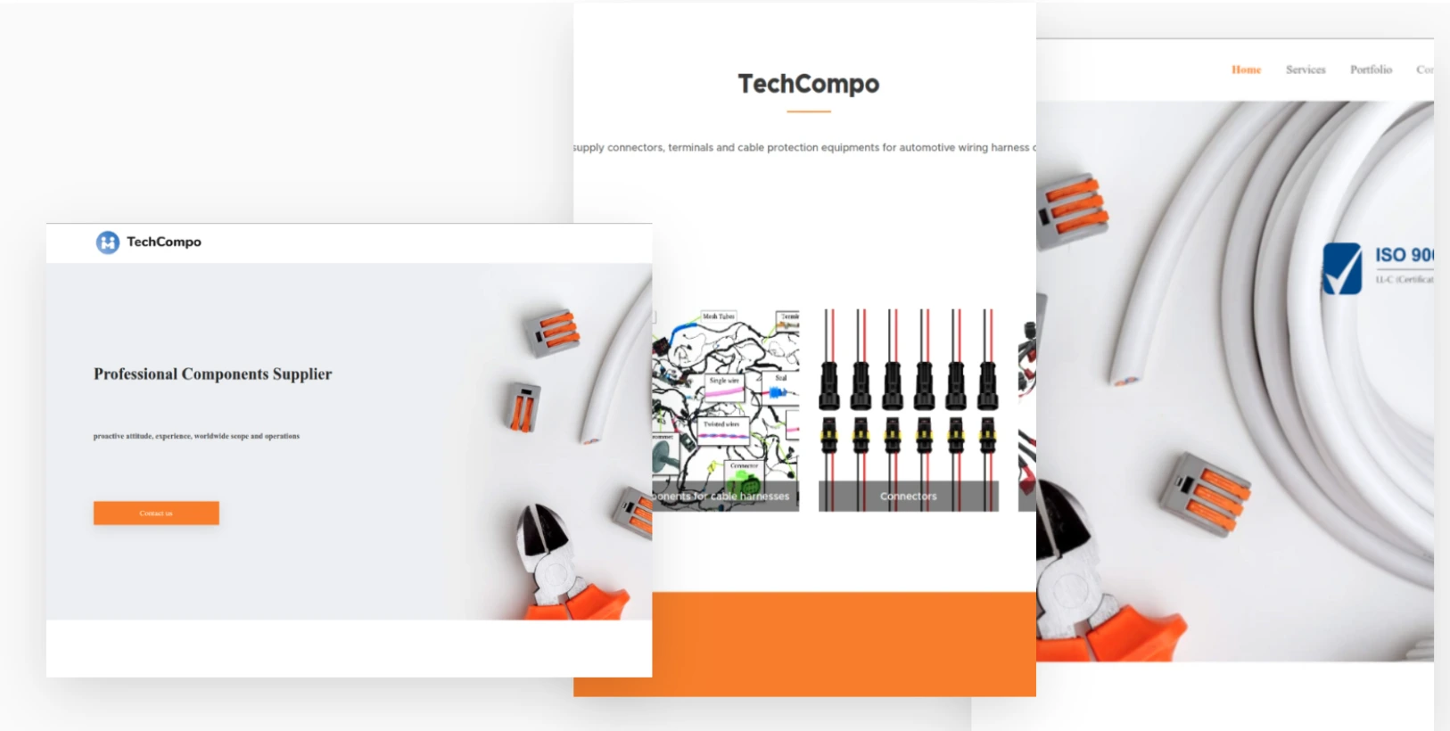
The original website had been created quickly using a template-based solution and did not feel like a professional business presentation. The goal was to create a representative multi-page website that would stand up in communication with both local and international partners.
Original Website
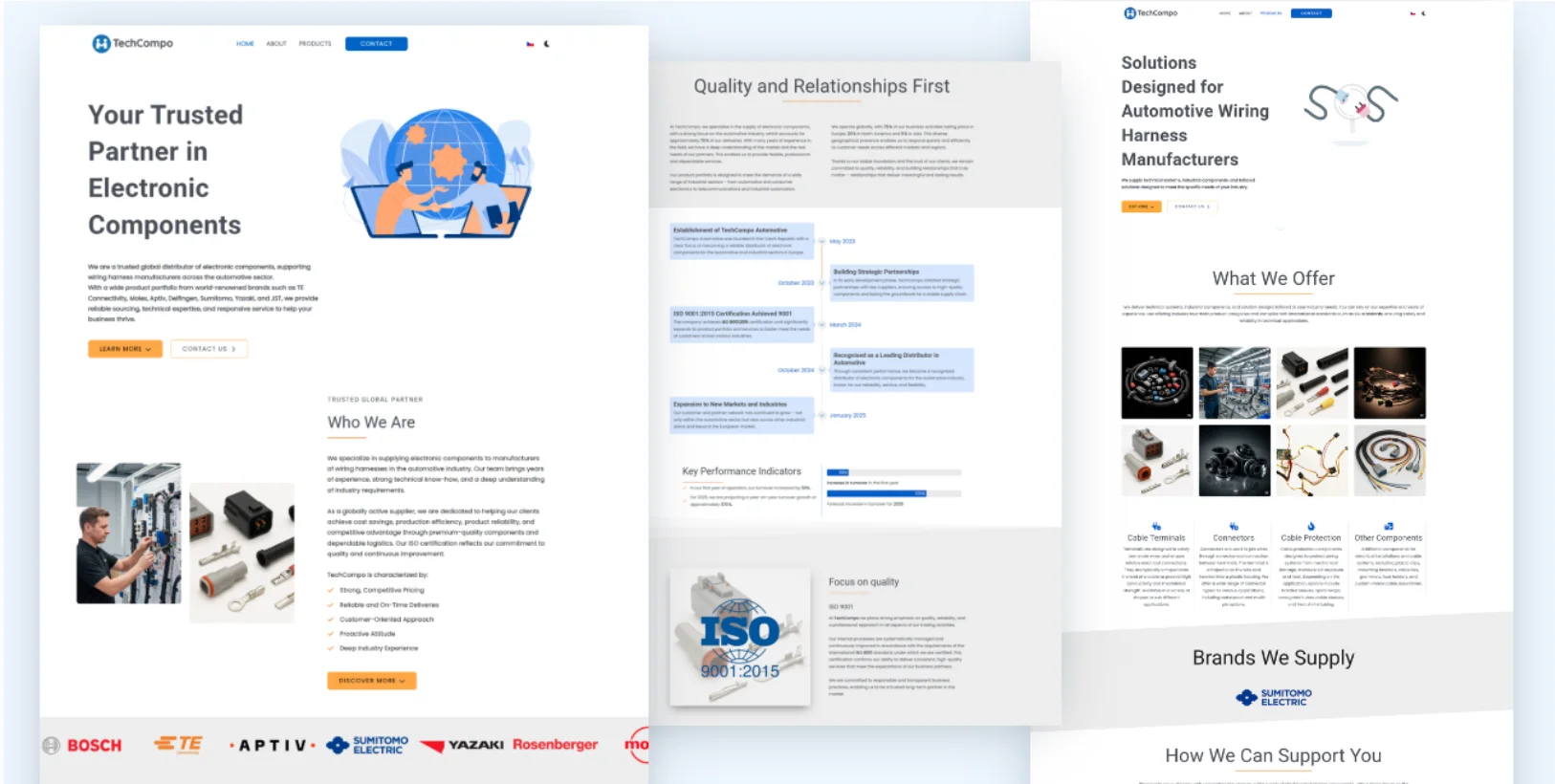
Redesigned Website
Initial State
A Webnode-based website with minimal content, no clear structure, and no consistent visual identity. It lacked business messaging and trust-building elements.
My Approach
Result
The website now functions as a professional business presentation that strengthens credibility and aligns with international B2B standards.
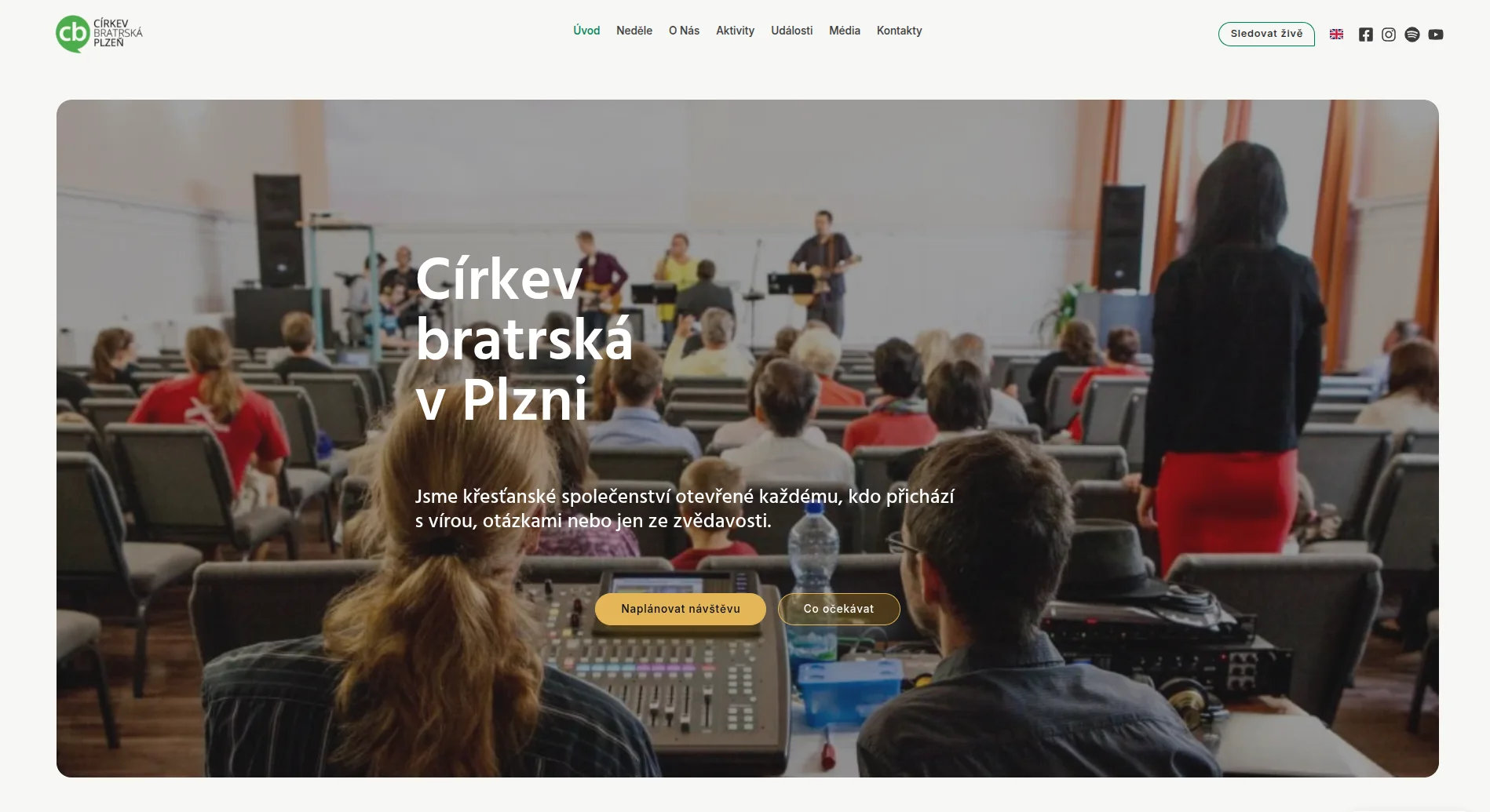
Brethren Church Pilsen (Církev bratrská Plzeň)
Redesign webu s důrazem na přehlednost, důvěru a první návštěvu
Information Architecture • UI/UX • Content Creation • Website Translation
The original website contained the necessary information, but it felt visually outdated and did not offer a clear enough path for first-time visitors. The goal of the redesign was to create a clear, trustworthy, and modern website that works better with structure, navigation, language, and the practical questions people have before their first visit.
Original Website
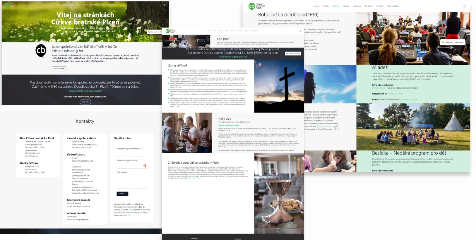
Redesigned Website
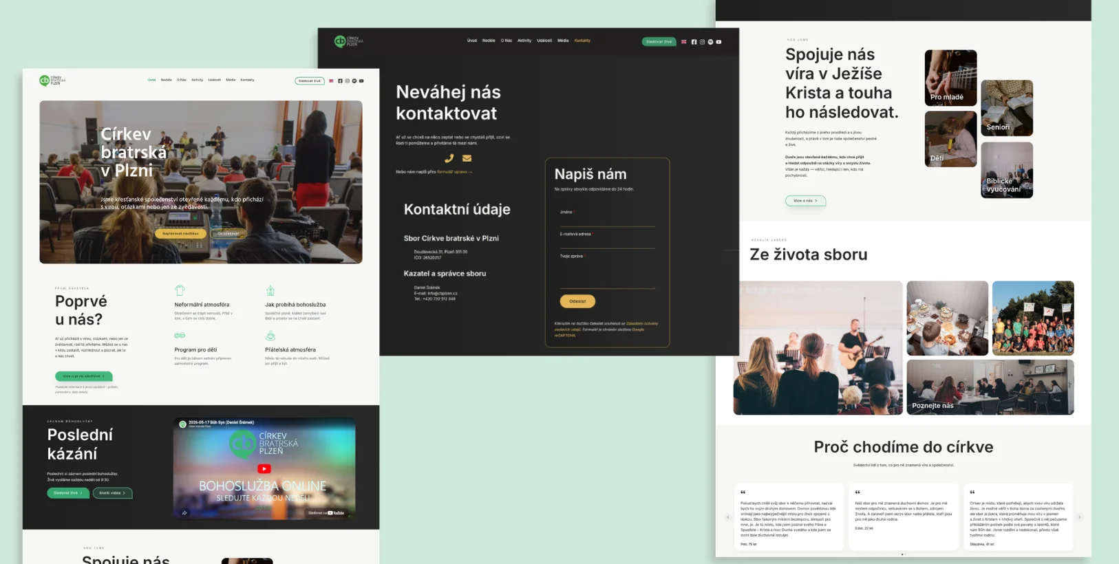
Initial State
The original website contained basic information about the church, services, and activities, but it did not feel like a clearly guided path for someone visiting for the first time. The information was available, but the website structure, navigation, and language did not help visitors quickly understand who the church is, when they can come, and what they can expect.
My Approach
Result
The new website feels more modern, calmer, and more trustworthy. Visitors can orient themselves more quickly and easily find information about the Sunday service, their first visit, activities, and current events. The website also communicates the atmosphere of the church more effectively — openness, humanity, and an invitation without pressure. The new structure helps guide visitors naturally from their first impression to the next step: coming in person, watching a service, learning more, or contacting the church.
“The new website is significantly clearer, more modern, and better structured than the previous version. It now engages visitors more actively and helps them quickly find their way around and locate the information they need.”
Let’s build a website that makes sense.
I design structured, professional websites that not only look good but also support trust and business goals.